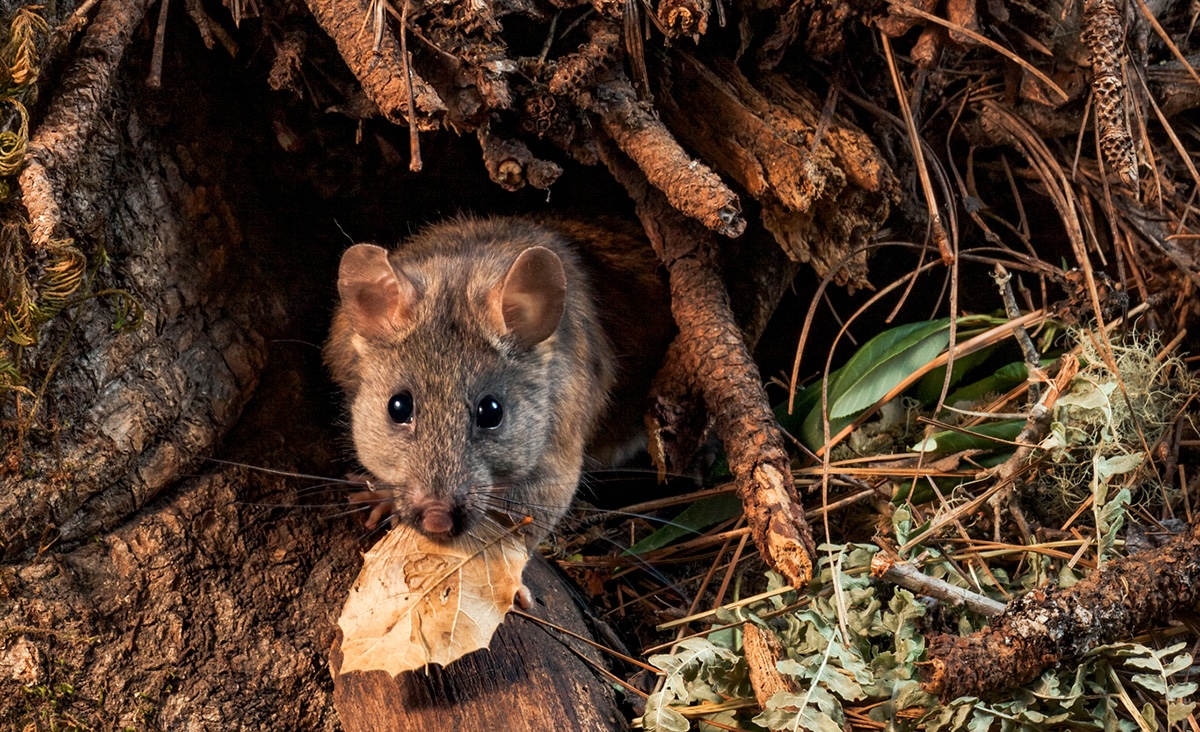
A dusky-footed woodrat (Neotoma fuscipes) emerges from its hole. (Photo by Jon Klein via Bay Nature Magazine.)
Today’s investigation. In past labs, we learned how to describe variation in biological data, test hypotheses, and build models to explain patterns. Today, we shift our focus to the genetic variation that underlies many of those patterns. Every population carries a story written in its DNA, shaped by history, isolation, and chance. We will use real genomic data from dusky-footed woodrats (Neotoma fuscipes) across California, collected by Dr. Robert Boria’s lab at San Francisco State University, to explore how geography and history leave signatures in genetic diversity. You will calculate basic population genetic statistics and interpret what they reveal about how populations are structured across the landscape.
Population genetics studies how genetic variation is distributed within and between populations. It helps us understand processes like gene flow, drift, and adaptation. Today you will explore genetic diversity across populations of dusky-footed woodrats, an important ecological species in California ecosystems.
Upon completion of this lab, you should be able to:
References:
In population genetics, a single nucleotide polymorphism (SNP) is a single base-pair position in the genome where individuals may differ. SNPs are the most common type of genetic marker and are widely used to study genetic diversity, population structure, and evolutionary history.
Suppose you are studying populations of an endangered species, the mountain gorilla (Gorilla beringei beringei). You genotype individuals from three isolated parks at a single SNP locus. The genotype counts for each location are shown below:
| Location | AA | AG | GG |
|---|---|---|---|
| Park A | 10 | 15 | 5 |
| Park B | 6 | 8 | 16 |
| Park C | 12 | 10 | 8 |
At this SNP locus:
We want to calculate two key measures:
Let's walk through the calculation for Park A.
First, calculate the total number of individuals sampled:
# Total number of individuals
total_individuals <- 10 + 15 + 5
Next, calculate the observed heterozygosity:
# Observed heterozygosity
H_obs <- 15 / total_individuals
Now, calculate the allele frequencies. Each AA individual contributes two copies of allele A, each AG individual contributes one copy of A. So:
# Frequency of allele A
p <- (2*10 + 15) / (2*total_individuals)
The frequency of allele G is simply:
# Frequency of allele G
q <- 1 - p
Finally, calculate the expected heterozygosity under Hardy-Weinberg equilibrium:
# Expected heterozygosity
H_exp <- 2 * p * q
Thus, in Park A, the observed heterozygosity is 0.5 and the expected heterozygosity is about 0.486. These values are very close, suggesting the population may be near Hardy-Weinberg equilibrium at this locus.
In the worked example above, you calculated genetic diversity at a single SNP. Now, we will explore how genetic similarity might change with geographic distance, by constructing two real distance matrices: one based on genotype differences, and one based on location.
What is a distance matrix? A distance matrix is a table showing how different each pair of individuals is. Rows and columns represent individuals, and each cell shows their distance: 0 if identical, larger if different. Matrices are symmetric, and distances along the diagonal are always 0 (an individual is identical to itself).
Suppose we have genotypes for four gorillas at one SNP locus:
| Gorilla | Genotype |
|---|---|
| G1 | AA |
| G2 | AG |
| G3 | GG |
| G4 | AG |
We can calculate genetic distance between individuals using a simple mismatch method:
# Create genotype data
genotypes <- c("AA", "AG", "GG", "AG")
names(genotypes) <- c("G1", "G2", "G3", "G4")

# Function to calculate pairwise genetic distance
genetic_distance <- function(g1, g2) {
  if (g1 == g2) {
    return(0)
  } else if (g1 == "AG" || g2 == "AG") {
    return(0.5)
  } else {
    return(1)
  }
}

# Build genetic distance matrix
gen_dist_matrix <- outer(genotypes, genotypes, Vectorize(genetic_distance))
gen_dist_matrix
This creates a genetic distance matrix:
| G1 | G2 | G3 | G4 | |
|---|---|---|---|---|
| G1 | 0 | 0.5 | 1 | 0.5 |
| G2 | 0.5 | 0 | 0.5 | 0 |
| G3 | 1 | 0.5 | 0 | 0.5 |
| G4 | 0.5 | 0 | 0.5 | 0 |
On larger datasets with many SNPs, we can also use other genetic distance metrics, such as FST or Nei’s distance, which compare allele frequencies between populations more formally.
Suppose these four gorillas were sampled at the following locations (in kilometers):
| Gorilla | X | Y |
|---|---|---|
| G1 | 0 | 0 |
| G2 | 0 | 10 |
| G3 | 10 | 0 |
| G4 | 10 | 10 |
We can calculate their pairwise geographic distances:
# Create coordinates
coords <- data.frame(
  X = c(0, 0, 10, 10),
  Y = c(0, 10, 0, 10)
)
rownames(coords) <- c("G1", "G2", "G3", "G4")

# Calculate geographic distance matrix
geo_dist_matrix <- dist(coords)
as.matrix(geo_dist_matrix)
Now we can test whether gorillas who are farther apart geographically are also more genetically different.
What is the Mantel test? The Mantel test formally compares two distance matrices to test whether they are correlated. In our case, one matrix represents genetic distances between individuals and the other represents geographic distances. A significant p-value suggests that individuals farther apart geographically are also more genetically different; a pattern expected under Isolation by Distance.
# Load the vegan package for the Mantel test
library(vegan)

# Perform Mantel test between genetic and geographic distances
mantel_result <- mantel(gen_dist_matrix, geo_dist_matrix)

# View the result
mantel_result
The output shows a correlation coefficient (r) and a p-value. If the p-value is small (typically < 0.05), it suggests a significant association between geographic and genetic distances.
Important: The Mantel test is specifically designed for comparing two distance matrices, where each entry represents a pairwise comparison between individuals or populations.
tidyverse, adegenet, hierfstat, vegan, vcfRNeo_fus.csv, Neo_fus.vcfFile descriptions: In this lab, we focus on two datasets. Neo_fus.vcf contains SNP genotype data while Neo_fus_locations.csv contains latitude, longitude, and location information for dusky-footed woodrats sampled across California while.
Today’s activity on genetic variation and geographic structure is organized into one main exercise that explores how isolation and movement shape genetic diversity among woodrat populations. This exercise will help us apply basic population genetic concepts, visualize genetic structure, and test hypotheses about isolation by distance.
Before we begin analyzing genetic structure, let’s load the dataset. Neo_fus.csv contains SNP genotype, latitude, longitude, and location information for data for dusky-footed woodrats sampled across California. We will use these data to calculate measures of genetic diversity and explore spatial patterns.
# Load metadata (locations, coordinates)
neo_fus_loc <- read.csv("Neo_fus.csv")

# Load SNP genotype data from VCF file
neo_fus_gen <- read.vcfR("Neo_fus.vcf")
# Convert VCF data to a genind object
genind_obj <- vcfR2genind(neo_fus_gen)

# View summary of the genetic data
summary(genind_obj)
1a. How many woodrat individuals are included in the genotype dataset?
1b. What information is included in the dataset?
# Summarize the genind object to get basic statistics
genind_summary <- summary(genind_obj)

# Extract observed and expected heterozygosity per SNP locus
observed_het <- genind_summary$Hobs
expected_het <- genind_summary$Hexp

# Combine into a tidy table
het_df <- tibble(
  Locus = names(observed_het),
  Hobs = observed_het,
  Hexp = expected_het
)

# View first few rows
head(het_df)
# Plot observed vs expected heterozygosity
ggplot(het_df, aes(x = Hexp, y = Hobs)) +
  geom_point(color = "gray60") +
  geom_abline(intercept = 0, slope = 1, linetype = "dashed", color = "red") +
  theme_minimal() +
  labs(x = "Expected Heterozygosity",
       y = "Observed Heterozygosity",
       title = "Observed vs Expected Heterozygosity")
2a. Do most loci have observed heterozygosity greater than, less than, or close to expected heterozygosity?
2b. What might cause loci to deviate from Hardy-Weinberg expectations?
Now we want to quantify genetic differentiation among populations using FST statistics. FST measures how much allele frequencies differ between populations.
# Assign populations based on metadata
pop(genind_obj) <- as.factor(neo_fus_loc$location)

# Convert genind object to hierfstat format
hf_data <- genind2hierfstat(genind_obj)

# Calculate basic statistics, including per-locus Fst values
basic_stats <- basic.stats(hf_data)

# View per-locus values, including Fst
basic_stats_perloc <- basic_stats$perloc

# Turn locus IDs (rownames) into a column
basic_stats_perloc$locusID <- rownames(basic_stats_perloc)
3a. Which SNP loci show the highest FST values? What do these FST values suggest about genetic differentiation among woodrat populations?
3b. Are there loci with very low or near-zero FST values? What biological or statistical factors might explain that?
Next, let's visualize the variation in FST values across SNPs using a bar plot.
ggplot2::geom_col().
In the worked example, you thought about how genetic similarity might change with distance. Here, we calculate two types of distances across real populations: geographic distance (based on coordinates) and genetic distance (based on allele frequencies).
# Calculate pairwise geographic distances
dist_geo <- neo_fus_loc %>%
  select(longitude, latitude) %>%
  dist()

# Calculate pairwise genetic distances between individuals
dist_gen <- dist(genind_obj)
ggplot2::geom_smooth(method = "lm").
Stop and Think: Stop and consider: What would you expect the relationship to look like if there is isolation by distance?
4a. Does your plot suggest a positive or negative relationship between geographic distance and genetic distance?
4b. What biological processes could create a pattern where genetic distance increases with geographic distance?
basic_stats and include an appropriate statistic to support your answer.Next week, we will extend what you learned here to build phylogenetic trees. Instead of simply comparing distances, we will use those distances to infer the evolutionary relationships among populations and species. Start thinking about how patterns of genetic similarity and difference might be shaped by common ancestry over time!
Great Work!
This activity was adapted from the Biostatistics using R: A Laboratory Manual by Raisa Hernández-Pacheco and Alexis A Diaz of California State University, Long Beach by Jenna T. B. Ekwealor for San Francisco State University.

This
work is licensed under a
Creative
Commons Attribution-ShareAlike 4.0 International License.